By Larissa Yoshiura on in Email Marketing
Dark Mode is Messing Up Your Emails
Whether you know it or not, there’s a user setting lurking out in the world waiting to mess with your next batch of emails. Enter dark mode. It’s not some new Gen Z TikTok term you’re just now hearing about. Dark mode is the latest popular tech setting which is likely screwing with the way your emails are landing in your audience’s inbox. It’s popping up on everything from phones to tablets, and even to car dashboards, so why is this new setting taking over tech?
What is Dark Mode and Why Are People Using It?
Simply put, dark mode lets you change an app’s background from light to dark. The setting is showing up in all major apps and is now a ubiquitous option on most phones. Why are so many people adjusting the visual settings on their phone or tablet? The primary reason is using dark mode has less negative consequences on your sleep and body than using your machine on its regular, more bright setting. With many people spending almost half their day staring at some sort of screen, fatigue is becoming a common symptom of too much screen time. Studies have shown prolonged visual exposure to bright screen time can result in increased headaches in addition to negatively affecting your sleep-related melatonin levels. The consequence is loads of people are switching over to dark mode, especially when using screens at night. After all, who doesn’t want fewer headaches and more sleep? Throw in the fact that dark mode also uses less battery and just plain looks cooler, and it’s a no brainer as to why people are opting in.
The Dark Side of Dark Mode
Despite its popularity, not all apps have gotten on board, and those that have adjusted have done so in their own unique way. Specifically, dark mode has been affecting the way users receive and read their emails. Gmail, iOS, and even Outlook have all been affected, as well as desktop apps. Typically, colors will be inverted in the emails, making some images and text impossible to read or at the very least difficult to read. What you design in-house isn’t always what ends up in people’s inboxes, so it becomes increasingly hard to control which colors the reader will actually see. Additionally, some older apps might not even work in dark mode.
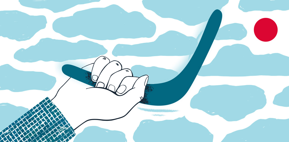
What’s The Fix?
Unfortunately, there is no simple fix as of yet, although new software updates for apps and computers have been taking dark mode into account. Firstly, you can’t send two versions of the same email, one for dark mode and for regular settings. There is no way as of yet to tell which settings the receiver of the email has chosen. Because there’s no standard across all users and platforms, it’s very hard, if not impossible, to predict who is using dark mode and who isn’t. The best way to address the issue is by finding a middle ground in terms of colors and design. An art director and developer must work closely, hand-in-hand to address current, standing dark mode issues as well as ones that might arise in future updates. Typically, the team will work together to optimize images and text for all platforms and settings, digging deep into HTML, metadata, and design. It’s no easy feat and takes time to update emails so all users can use them properly. There are plenty of online guides with instructions and guidance on where to begin but realize now there’s currently no shortcut to addressing the dark mode issue.
Looking Forward
Dark mode doesn’t seem to be going anywhere. Until it becomes standardized across all platforms and users, it will take time and work to ensure your emails are being received in the way you intended. Creative and development need to work closely together to create content that is readable and delivers correctly. And of course, never stop testing your emails! It’s the best and most reliable way to confirm you’re getting the most out of your work.